Content Approval System
Redesigning content review across 2 apps, 2 user types, and 6 modules at CreatorIQ.
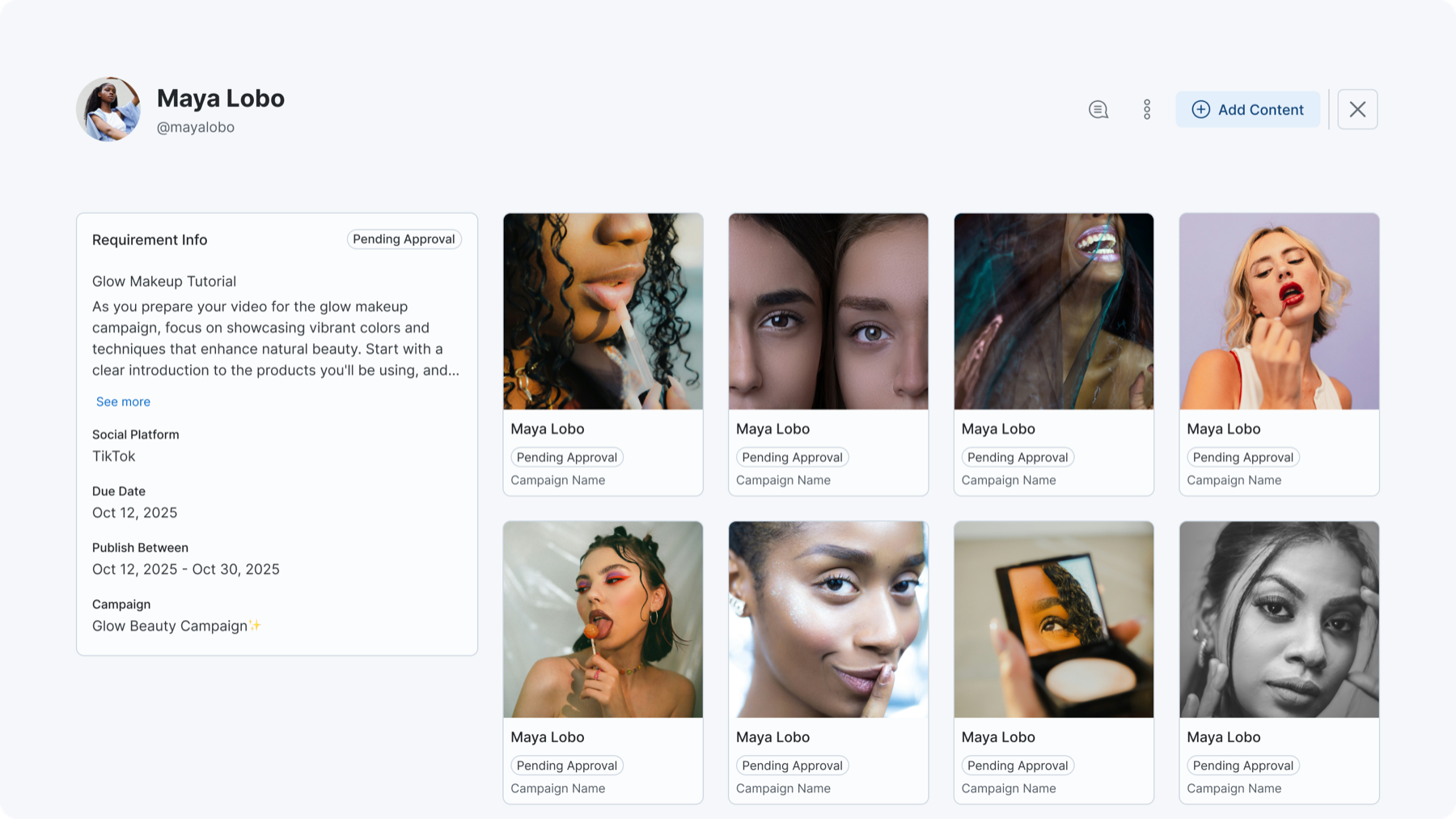
Requirement view with content grid, approval statuses, and requirement details panel.
Before
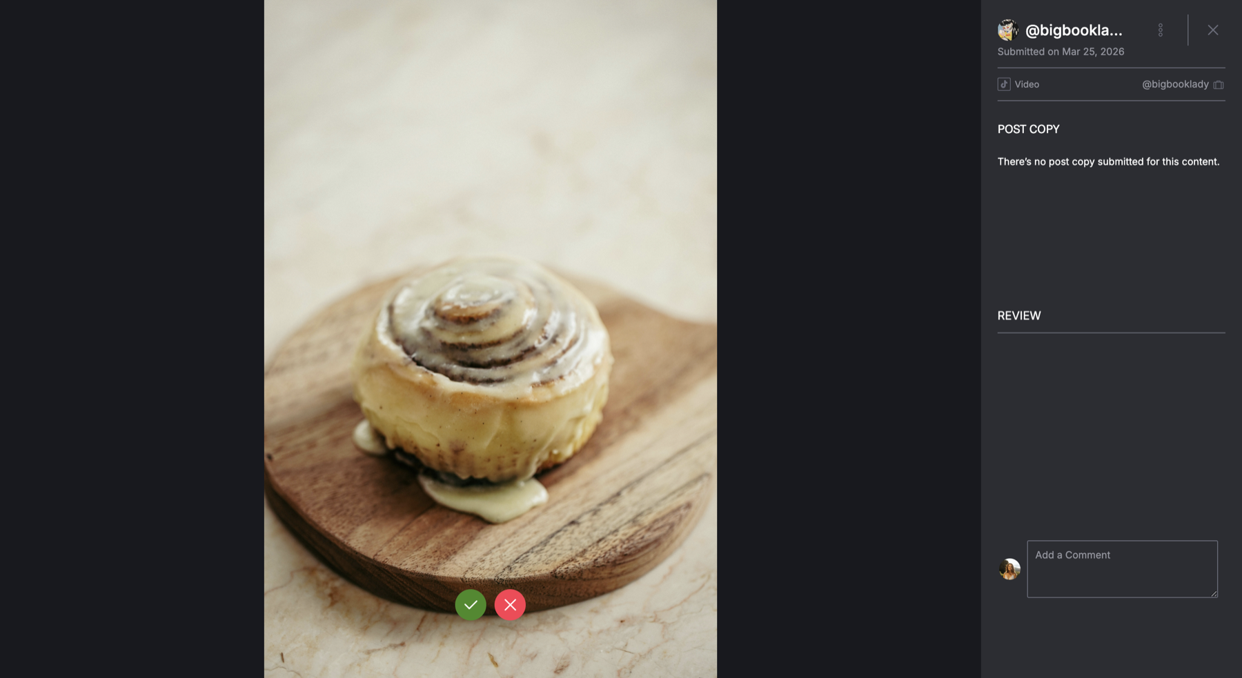
Basic media preview with a single comment box and approve/reject buttons. No content details, no comment separation, no versioning.
After
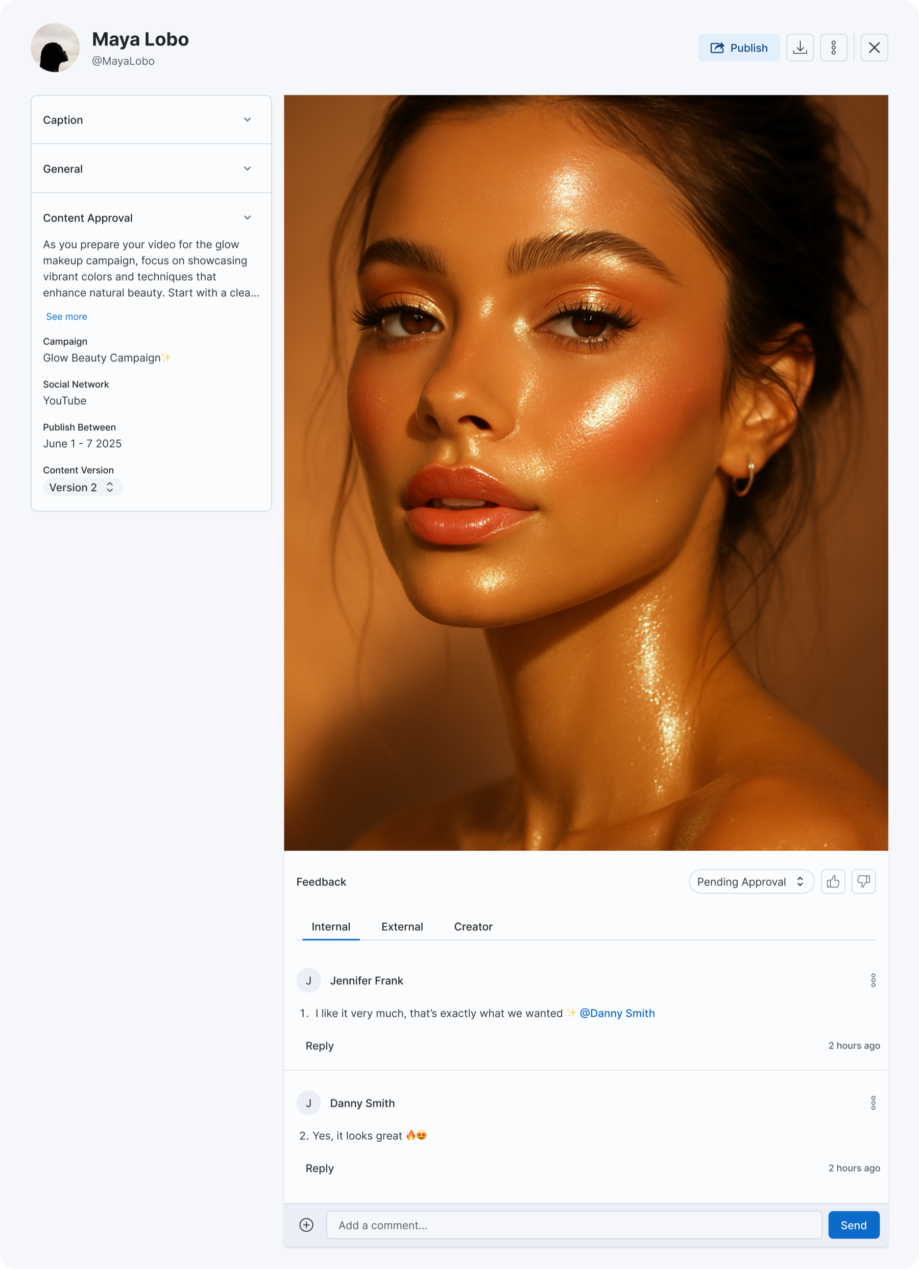
Full media file modal with content details panel, approval status, three-tab commenting (Creator / Internal / External), and publish actions.
The Flow: End to End
Click through to see how content moves from creator submission to manager approval. Each step shows which app and which user type is active.
This is a simplified prototype illustrating the workflow, not a representation of the actual CreatorIQ interface.
Creator receives brief
The creator opens their portal and sees the campaign requirements — what to shoot, brand guidelines, publish window.
Glow Beauty Campaign
Requirement: Hero product shot
What I Shipped
I broke the redesign into four interconnected PRDs, each addressing a different layer of the system while keeping the same component patterns and approval states across both apps.
Modernizing the Planned Post Tab
React migration with feature parity. The redesigned media file modal shipped here first. Every other PRD depended on this one.
Collections within Campaigns
Content organization for campaign managers. Collections group posts and media files for curation, external sharing, and publishing.
Media File Module Redesign
One modal for any media file. Content approval status, three-tab commenting (internal, external, creator), version control, and file actions in one component.
Adding Versioning
Creators upload new versions through their portal, managers compare side by side, lock approved versions. Works across mobile and web.
Six modules share data and state. Change how media files work and you change what collections display, how versions get tracked, and what creators see in their upload flow.
Planned Posts
Posts with requirements, media files, and approval workflows. The core unit campaign managers work with daily.
Media Files
Individual assets attached to requirements — images, videos, documents. Each has its own approval lifecycle.
Content Approval
Multi-stakeholder review across internal teams, external partners, and creators. Comments, status tracking, role-based visibility.
Collections
Content organization within campaigns. Group posts and media files, share externally, publish as curated sets.
Versioning
Structured submission tracking. Creators upload new versions, managers review and compare, version history with locking.
Creator Portal
External-facing app (mobile + web) where creators submit content, upload new versions, and respond to feedback.
Key Design Decisions
One modal, two contexts
Engineering initially proposed building two separate modals — one for campaigns, one for the creator portal — since the codebases were different. I pushed for one unified component because two modals would inevitably drift apart. Same data, same modal, different permissions.
Three-tab commenting model
The default approach was thread-level permissions — one comment thread with visibility rules per message. I rejected this because mixed-audience threads caused campaign managers to self-censor. Separate tabs meant managers could be blunt without worrying a creator would see it. Simpler model, better behavior.
Version locking, not overwriting
One option was to restrict uploads after approval. I rejected this because it would block legitimate revisions. Instead: approve a version, it's locked, but new versions can still be uploaded. The manager explicitly decides when to shift approval to a newer version.
Context
When this project started, it was scoped as a media upload fix. After auditing the full content lifecycle, I showed the team this wasn't a feature problem — it was a system problem. Approval status, feedback, versioning, and content organization were all tangled together across 6 modules and 2 apps with no shared patterns. That audit changed the scope from a single-feature redesign to a full system redesign.
Campaign managers jumped between three separate screens to review one piece of content. Creators had no way to submit a revised file without emailing it. Internal and external feedback lived in different threads. The basic question — is this asset approved or not? — had no definitive answer in the UI.
Want to see the designs?
The Figma files, interaction flows, and edge cases are better shown than described. Let's talk.
Book a call